
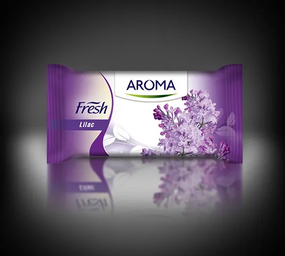
My expertise lies in crafting design concepts and print-ready artwork for your product line
The important process of Pre-Press involves intricate technical steps that allow intricate design ideas to come to life in the final printed product.
When discussing graphic design, it’s impossible not to mention prepress file preparation.
Prepress Preparation in Graphic Design
We all know this is the final stage, yet it’s absolutely critical to the success of a product’s visual outcome. Whether you need a new package, brochure, label, or company catalog, you’ll require a graphic designer with strong expertise in prepress processes.

What’s Most Important in Preparing Files for Print?
Throughout my many years as a graphic designer, I’ve encountered numerous interesting cases. Generally, the main issue is that the colors we see on a screen don’t always match those of the final printed product. So, where does this discrepancy come from?
First, device screens display colors in a different color mode (RGB), while files prepared for printing use a different color profile (CMYK). This is where the biggest difference arises. As a result, it’s common for a design approved by a client to look different once printed on paper, cardboard, or another material—often, the colors don’t match what was initially approved. The primary challenge lies with vibrant colors: they look stunning on a monitor but lose their intensity on paper, sometimes appearing faded. This, again, stems from the difference between the two color profiles.
Another Key Consideration: Die-Cutting
Another significant issue is the die-cut, or the tool that shapes the design into its final form. Every skilled designer knows how to position their work to align perfectly with the die-cut specifications.
The Role of Additional Colors (Pantone and Spot Colors)
Additional colors like Pantone and Spot Colors are created separately (I typically generate them using Adobe Illustrator) to bridge this color gap. To put it simply, an experienced designer will use Pantone and Spot Colors to ensure vibrant hues are accurately reproduced during printing on various materials.
Working with Images
This brings me to working with photos. It’s not uncommon for a file sent to the printer to come back with feedback that the images aren’t in the proper resolution. This happens due to resolution differences. Every image must be prepared at a minimum of 300 dpi to ensure the photos integrated into the design are printed with high quality.
The Font Issue
The final challenge you might face is related to fonts. Sometimes, the fonts in your freshly printed brochure differ from those specified in the design. This issue is more manageable: you simply need to send the fonts used in your design to the printer. This is especially important if you later request text corrections directly from the print shop.
How Can I Assist?
I hope this information has been at least somewhat helpful. If you’re struggling with prepress file preparation or can’t resolve a specific issue, don’t hesitate to reach out. I’d be happy to assist, ensuring your product is printed flawlessly.
Explore the other two services I provide to help boost your brand
Logo Design
A logo is super important for building a solid business identity.
Packaging Design
Elevate your brand with my creative packaging design.