
How a few sketched strands made a logo truly unique
While designing the logo for this cosmetics company, I incorporated several lines associated with strands of hair.
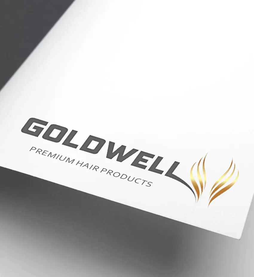
Redesign of the logo for the company GoldWell.

New logo for reconstruction of damage hair shampoo.

Creating a logo for the GoldWell perfume.
Let your clients to immediately feel and understand the logo’s message.
The logo needs to reflect the company’s message
As you embark on the process of designing your logo, it would be beneficial to take a moment to consider the incorporation of a distinctive and creative element that can truly elevate your design. For example, during the logo design for this cosmetics company, I made a conscious decision to include several lines that are reminiscent of strands of hair.
The inclusion of this thoughtful design element in the logo serves a dual purpose. Not only does it add to the visual appeal, but it also allows your clients to easily connect with and understand the underlying message. At its core, this message highlights the range of products that are specifically designed to care for and nourish their hair, showcasing the brand’s commitment to their customers’ well-being.
Showcase the benefits of your brand directly in the logo
I will explain my method for handling requests to design a logo. My aim is to assist those looking to establish their own brand or those interested in revamping their current logo.
To start, I usually think about the most appropriate element to incorporate into the logo. In this instance, the brand GoldWell specializes in products designed to nourish and enhance the beauty of hair.
After brainstorming some initial ideas, I developed the concept of creating a seamless connection between the logo and several strands of hair. To do this, I designed the final letter “L” and intertwined it with a few artistically rendered hair strands. I think it’s easy to see why I incorporated these lines—to subtly lead clients towards the themes of hair and women’s hairstyles. Additionally, I always recommend to my clients that they visually distinguish and separate the trademark in the logo from the primary typeface.
I highlighted this difference by selecting a different color for the abstract hair strands. I opted for a gold hue, in contrast to the main font color, which is a dark graphite tone.
As you can see in the designs above, I intentionally used the element resembling hair strands even without the GOLDWELL inscription. This method of presentation is also used by other brands, allowing companies to have a distinct trademark that can be used in various situations without the main font and slogan.
In conclusion, it can be argued that a logo that is creative and unconventional has a higher chance of being memorable. This distinctiveness can be a valuable asset for any company, giving them an edge over competitors. Therefore, it is worth considering taking a unique and innovative approach when designing a logo for your business.
Explore the other two services I provide to help boost your brand
Logo Design
A logo is super important for building a solid business identity.
Packaging Design
Elevate your brand with my creative packaging design.