
Clean and modern cosmetic line – Creme para pentear label Design
A clean and modern line for the cosmetic brand MSA. These labels were created using only blue color. The blue was more than enough to emphasize the quality and style of this brand.
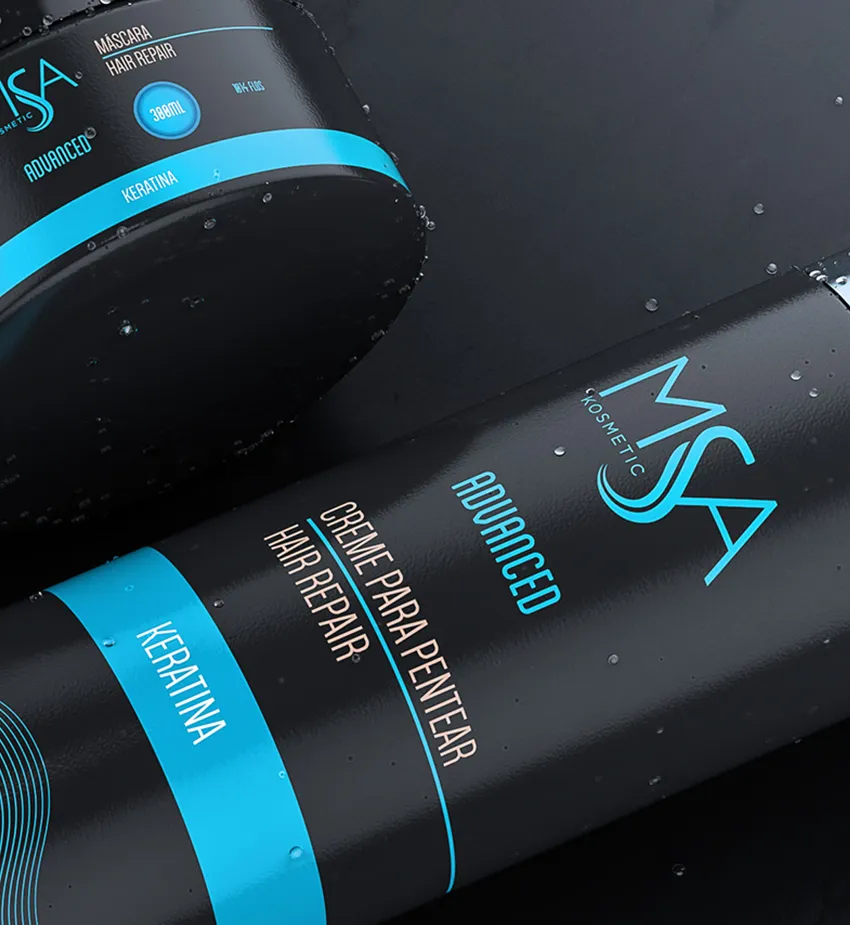
Creme para pentear label design for MSA cosmetics.

A distinct vision through beautiful labels for your cosmetic company.

Each label should be tested in the black-and-white range.
Dive into the elegance of simplicity
A distinct vision through beautiful labels for your cosmetic company
These stunning labels were crafted using solely blue, a color that speaks volumes about quality and sophistication. The choice of a single hue not only enhances the brand’s identity but also captures the essence of style and class.
Whether it’s the calming vibe or the professional touch, blue does it all! Discover how a thoughtful color palette can elevate your branding and leave a lasting impression.
Blue Elegance: Single Color Elevates Brand Quality and Style!
I have always aimed to convey the main idea briefly and clearly. As you can see, there is nothing excessive in these stylish labels. The company’s logo is clearly visible and serves as a focal point. The thin and elegant lines simultaneously convey a sense of delicacy and sophistication.