
Logo for Orbis Foods Chocolate Candies
Imagine your hands brushing against a candy package. But before you open it, your gaze falls on the logo—a sleek typeface paired with a few graceful lines that whisper, “A sweet journey, crafted with care for natural ingredients.”
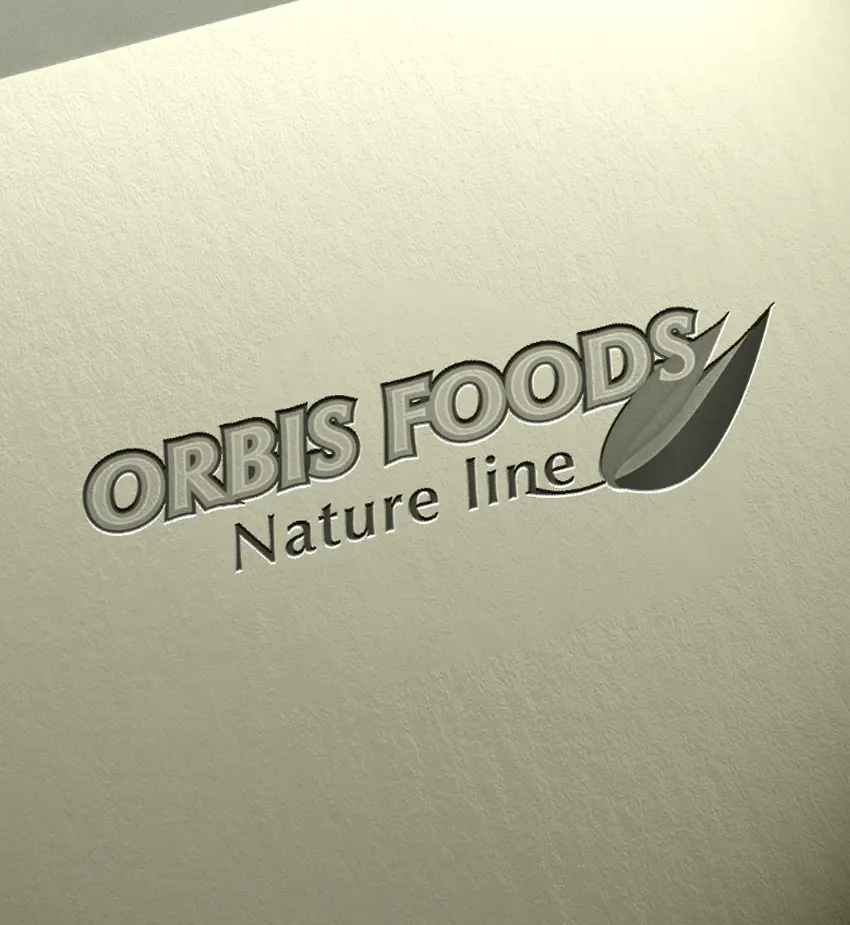
Black and white version of the OrbisFoods logo
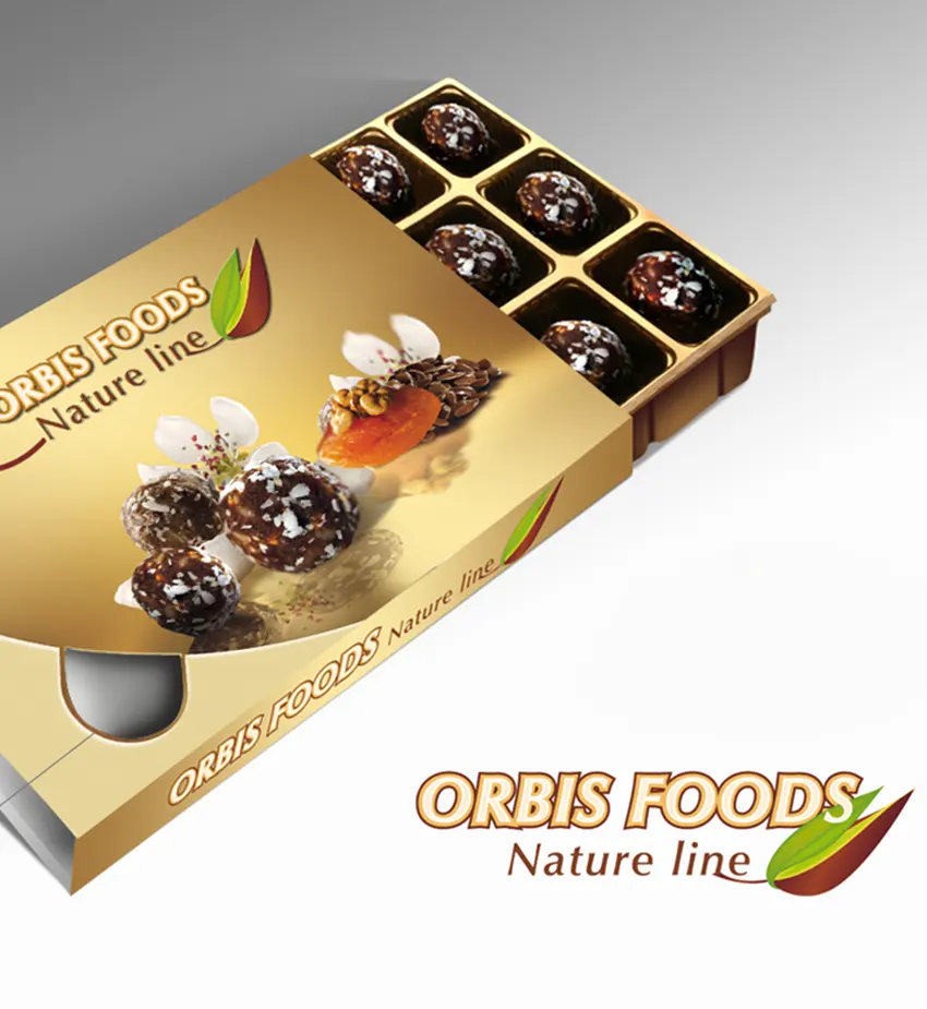
Creating a logo for OrbisFoods chocolate bonbons
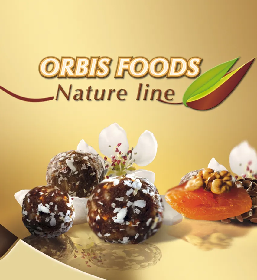
Use of the graphic logo for social media design

Use of the graphic logo for a shelf talker
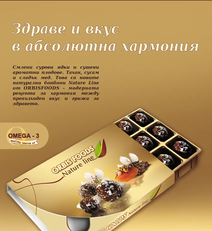
Use of the graphic logo for a magazine page

Use of the graphic logo for calendar design
Beneath the logo, in a soft and delicate touch, I’ve added the words “Nature Line” in a complementary font. There’s something soothing and gentle in this little message. It’s the voice of a brand that truly grasps the meaning of “natural.” Here’s a glimpse of how just a few elements in a logo can highlight the core idea.
Then you notice it—a tiny leaf. Small, yet so striking. It stirs something in you: nature, natural ingredients, the scent of cocoa beans, the rustle of leaves swaying in a gentle breeze. In that moment, you realize you’re not just choosing candies. You’re choosing a feeling, a vision. You’re not holding mere chocolates—you’re cradling a message forged over years.
A well-crafted logo isn’t just a symbol; it’s a master storyteller. Without a single word, it evokes emotion. In designing the “Orbis Foods – Nature Line” logo, I aimed to capture a promise of style and refinement—something distinct that lingers in your mind long after the chocolate melts away.
“Orbis Foods” – A Sweet Journey with a Natural Message
The purpose of each logo is to be memorable. Let’s be honest: the world brims with logos—vibrant colors, elegant fonts. But what sets them apart? Many are mere decoration. Some shout for attention yet fade unnoticed. A thoughtful logo, though, builds trust in a brand. That’s what “Orbis Foods” does. Its original typeface signals reliability—no clutter, just clarity, mirroring the product’s quality. Below it, the subtle “Nature Line” whispers, “Here’s something real.” A single leaf carries a world of meaning—life, growth, naturalness. Simple, yet profound.
When a brand dares to offer emotion, not just a product, something special is born. “Orbis Foods” achieves this quietly, without fanfare. Its vision tells a story. The moment a customer touches the package, they join that tale, becoming the hero of their own little ritual. Unwrapping isn’t just an act—it’s an experience.
When I was assigned to design the logo for “Orbis Foods,” the company already possessed a logo, but the packaging was quite bland. It may have been tasty, but it didn’t stand out among the numerous competitors. While designing their logo, I wanted it to evoke associations with quality and emotion. The box is no longer just packaging – it is a finished product, and the logo is crafted by a professional graphic designer.
The combination of the golden packaging and the natural texture of the leaf results in a luxurious yet organic aesthetic. This reflects a dedication to premium chocolate treats and an environmentally sustainable lifestyle—an embodiment of excellence.
Why does every brand need a creative logo like this?
The logo serves as a brand’s initial impression, representing the first visual interaction between the customer and the company. If this encounter evokes a positive, assured, and unforgettable feeling, it paves the way for a smoother experience ahead. “Orbis Foods – Nature Line” is poised to gain customer trust due to its visual identity, which signifies exceptional quality. Once this promise is met, that trust becomes lasting.
This is how a story is crafted. How a bond is built. How desire ignites—not for the logo itself, but for the feeling it leaves behind. People don’t remember facts or figures—they remember emotions. A logo designed with soul, thought, and attention to detail takes on a life of its own.
Still wondering what a successful, inspiring logo looks like? Now you know. “Orbis Foods – Nature Line” – a logo that invites you to make your choice.
If you need a unique logo for your chocolate candies, I’d be delighted to assist. Don’t hesitate to reach out.
Explore the other two services I provide to help boost your brand
Logo Design
A logo is super important for building a solid business identity.
Packaging Design
Elevate your brand with my creative packaging design.